Charting the Chaos: Six Visuals That Capture the Stock Market's 2025 Roller-Coaster
Navigating the Peaks and Valleys of a Volatile Year
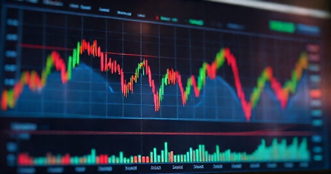
The financial landscape of 2025 has been a masterclass in volatility, defined by sharp rallies, sudden corrections, and unpredictable sector rotations. A new analysis, visualized through six key charts, maps the turbulent journey investors have endured this year, highlighting the powerful macroeconomic forces and shifting investor sentiment driving the wild swings.
The Anatomy of a Roller-Coaster Year
The charts illustrate several critical phases. One tracks the dramatic impact of evolving central bank policy expectations, showing markets lurching between hopes of easing and fears of persistent inflation. Another details the extreme intraday volatility, with several sessions seeing the major indices swing over 3% from peak to trough.
- A chart mapping sector performance reveals a stark rotation out of previous high-flying tech names into energy and defensive stocks during risk-off periods.
- Volatility index (VIX) readings spiked to multi-year highs on at least three separate occasions, each corresponding with a geopolitical flare-up or unsettling economic data.
- The divergence between mega-cap stocks and the broader market widened significantly, only to violently snap back during the October sell-off.
- Bond market turmoil, depicted in a yield curve chart, consistently acted as a precursor to equity market distress.
This graphic narrative underscores a year where traditional correlations broke down and 'buy-the-dip' strategies were repeatedly tested. For investors, the 2025 charts serve as a stark reminder of the market's fragility in the face of unresolved inflation debates, geopolitical uncertainty, and the lagged effects of aggressive monetary tightening.